to the article
'Methods for pitch analysis in contemporary popular music: multiple pitches from harmonic tones in Vitalic's music'
The videos have no visible controls. Simply click on them to play and pause.
A. Number of perceived pitches
This section complements Section 3.2 of the main paper.
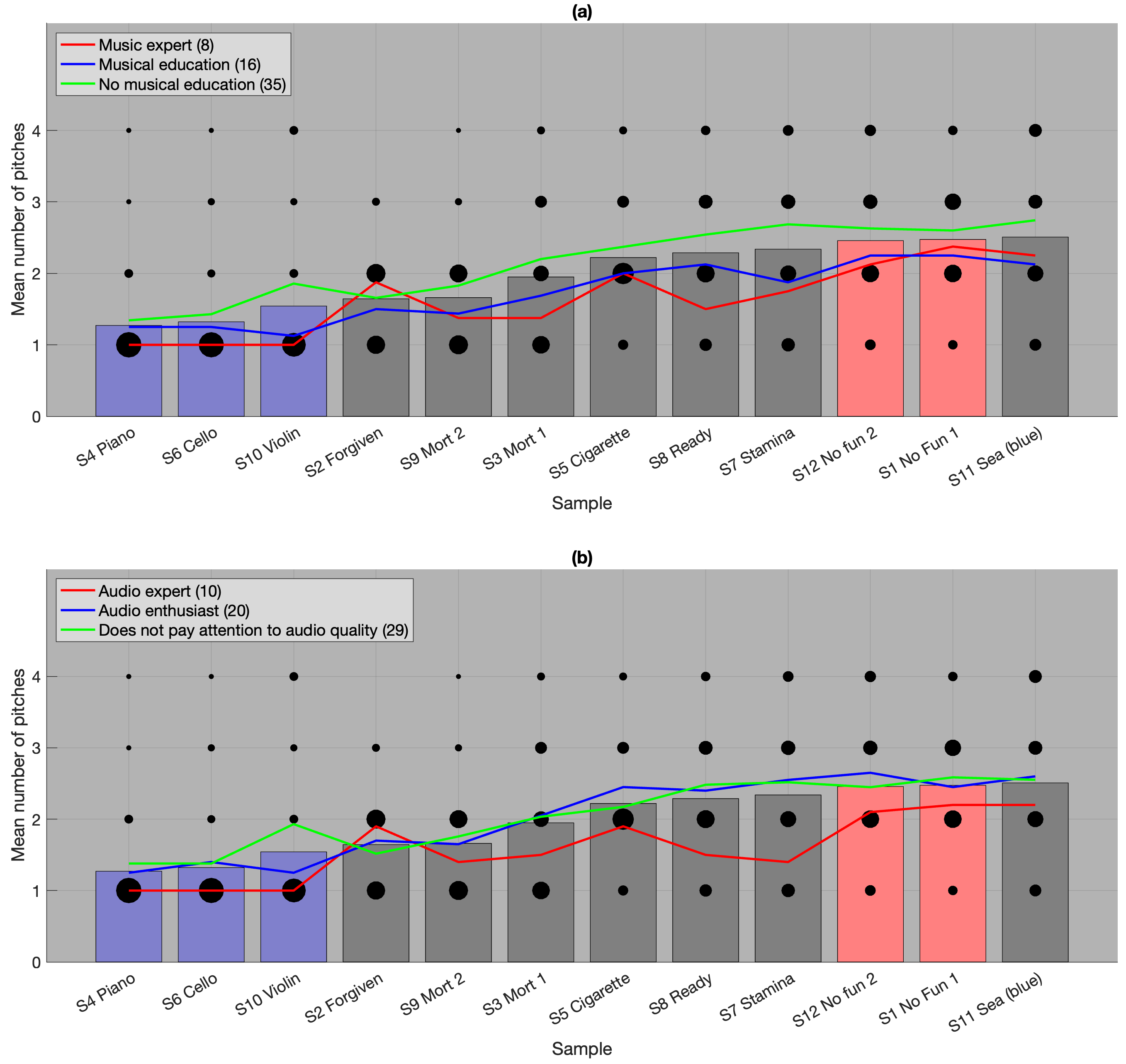
Figure A. Number of perceived pitches. Click on each vertical bar to hear the corresponding extract.The size of each dot indicates the number of responses. The bar graphs, identical in (a) and (b), represent the overall mean of the responses. The blue bars correspond to acoustic sources, and the red bars correspond to tones that cannot be modelled as quasi-harmonic. The coloured lines indicate the means based on music expertise (a) and audio expertise (b).
B. Solo Cello (sample 6)
This section complements Section 5.1 of the main paper.
STFT and STAC
Video B. Cello (sample 6). (a) STFT, (b) STAC.
The yellow scatter plots show the transcribed pitches. The blue scatter plots show the maximum autocorrelation, with marker widths indicating f0 energy. The autocorrelation peak deviates slightly from the transcribed pitches, as the Y-scale values correspond to a 440 Hz tuning, while the sample's tuning was measured at 445 Hz.
C. 'Forvigen', bass (sample 2)
This section complements Sections 5.2 and 7.2.2 of the main paper.
The vertical blue lines show the `note''s limits. The yellow scatter plots show the transcribed pitches.
Context for sample 2, STFT
Video C2. `Forgiven', context for sample 2 (unweighted). Bass track from source separation..
D. 'Stamina', bass (sample 7)
This section complements Section 5.3 of the main paper.
STFT and STAC
Video D. 'Stamina' (sample 7). (a) STFT, weighted audio. (b) STAC, weighted audio.
The vertical blue lines show the `note' start. The yellow scatter plots show the transcribed pitches.
E. 'No Fun', main synthesiser (sample 1)
This section complements Section 5.4 of the main paper.
STFT and partial's position
Video E1. `No Fun', 0'12 to 0'14. Main synthesiser part.
(a) STFT, weighted audio. The vertical blue lines indicate the positions of the eighth-notes. The yellow scatter plots show the transcribed pitches.
(b) Partials from tracking, middle position of each 'note'. The bottom blue lines and the framed text below indicate the mean differences between partials. The solid black lines mark the positions of detected peaks, while dotted black lines indicate the positions of missing peaks near the mean differences between partials. The height of the green triangles represents the frequency difference between multiples of the mean differences between partials and the detected peaks. The top framed text displays the mean difference.
Context for sample 1
Video E2. 'No Fun', main synthesiser, 0'08 to 0'48, includes sample 1.
(a) STFT of the unweighted audio, with the yellow scatter plot indicating the peaks.
(b) Median of the difference between consecutive partials, weighted by their energy. The background shows the distribution of median differences, with a peak at A1 + 5 cents.
F. Powerchord (sample 13)
This section complements Section 5.5 of the main paper.
STFT and STAC
Video F. Power chord (sample 13). (a) STFT, weighted audio. (b) STAC, weighted audio.
The yellow scatter plots show the transcribed pitches.
G. 808 Woofer Warfare (sample 14)
This section complements Section 5.6 of the main paper.
STFT, seven modes
Video G1. Omnisphere, Seismic Shock library, `808 Woofer Warfare' patch, STFT for the seven modes. Unweighted audio.
The yellow scatter plots show the transcribed pitches.
H. Violin (sample 10)
This section complements Section 6.2 of the main paper.
STFT and FT for one frame
Video H1. Violin (sample 10), unweighted audio.
(a) STFT, (b) FT for the frame marked by the vertical line in (a). In both (a) and (b), white dots indicate partials of the currently played note, blue dots correspond to the previously played note, and the red dot to an earlier note.